Rhodes Brook is an independent financial planning firm in Liverpool, known for empathy, clarity, and genuine care in how they advise clients on pensions, investments, and protection. The reputation was strong. The brand and website were not keeping up.
The problem
The old site felt corporate and outdated. The messaging did not reflect how the team actually communicates - openly, clearly, without jargon. They needed a complete refresh that would capture their personality and present them as the modern, approachable business they had become.
The solution
Sood started by defining five brand pillars with the Rhodes Brook team: Empathy, Personalisation, Trust, Expertise, and Education. These became the foundation for everything that followed.
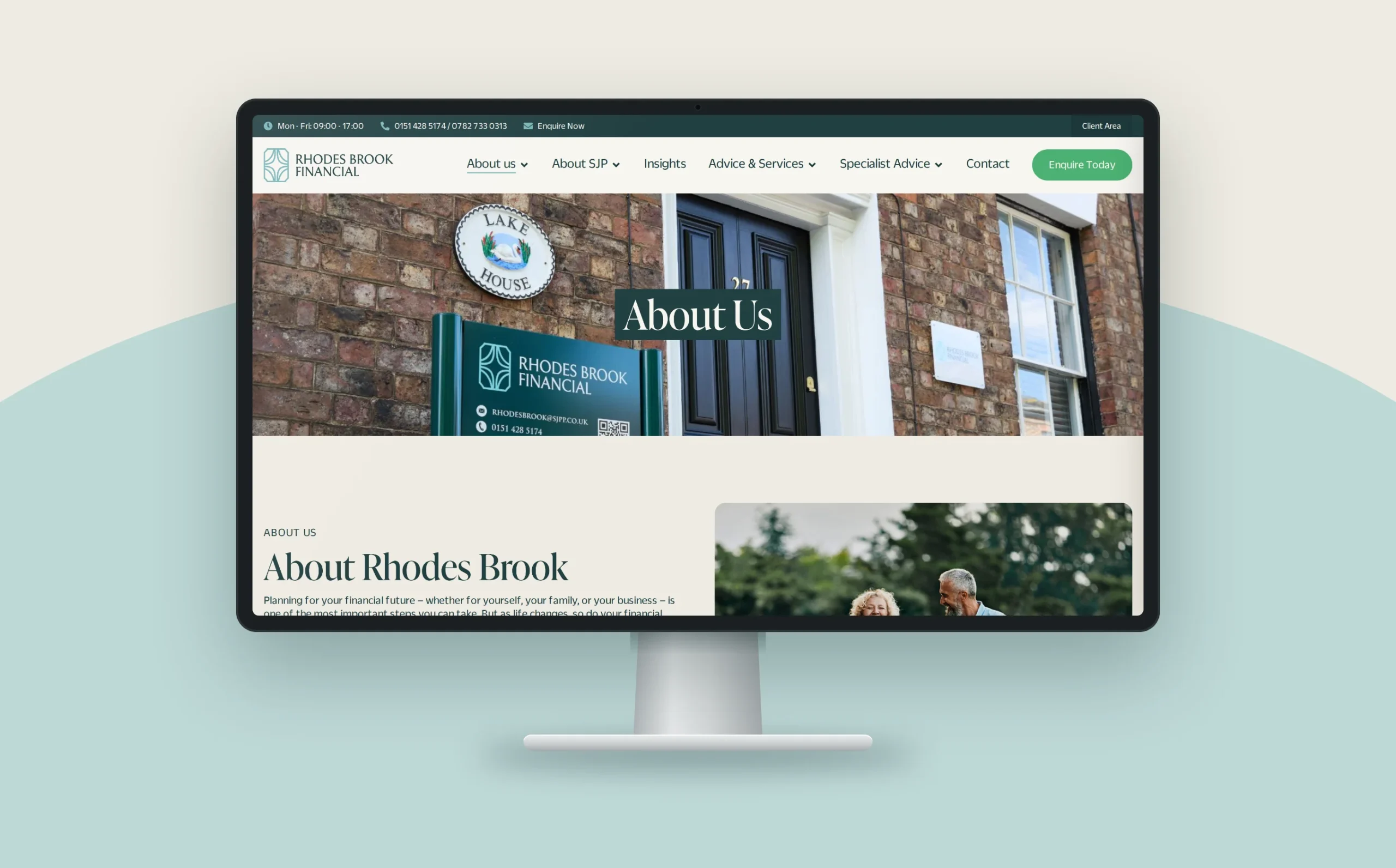
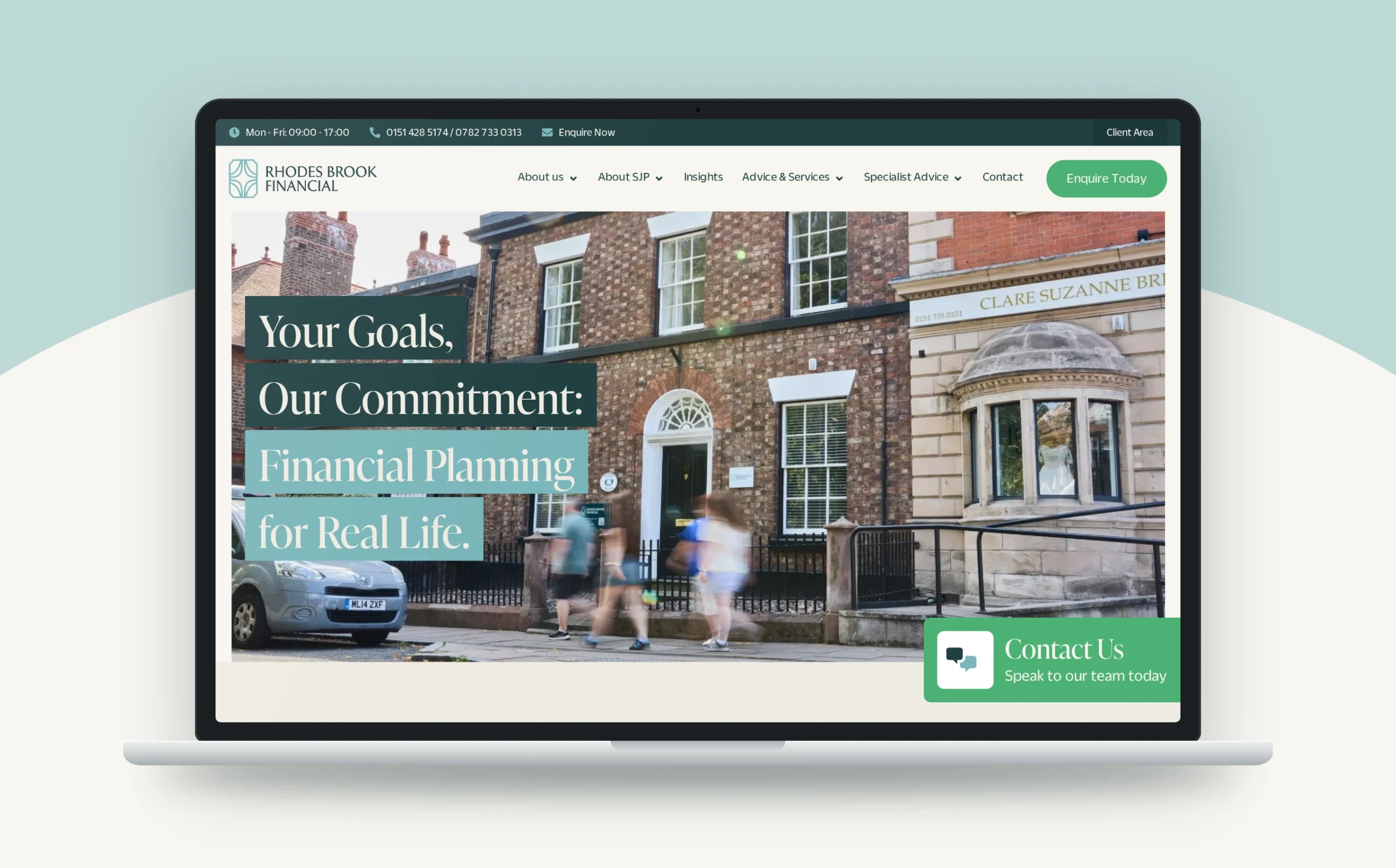
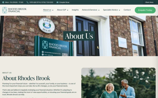
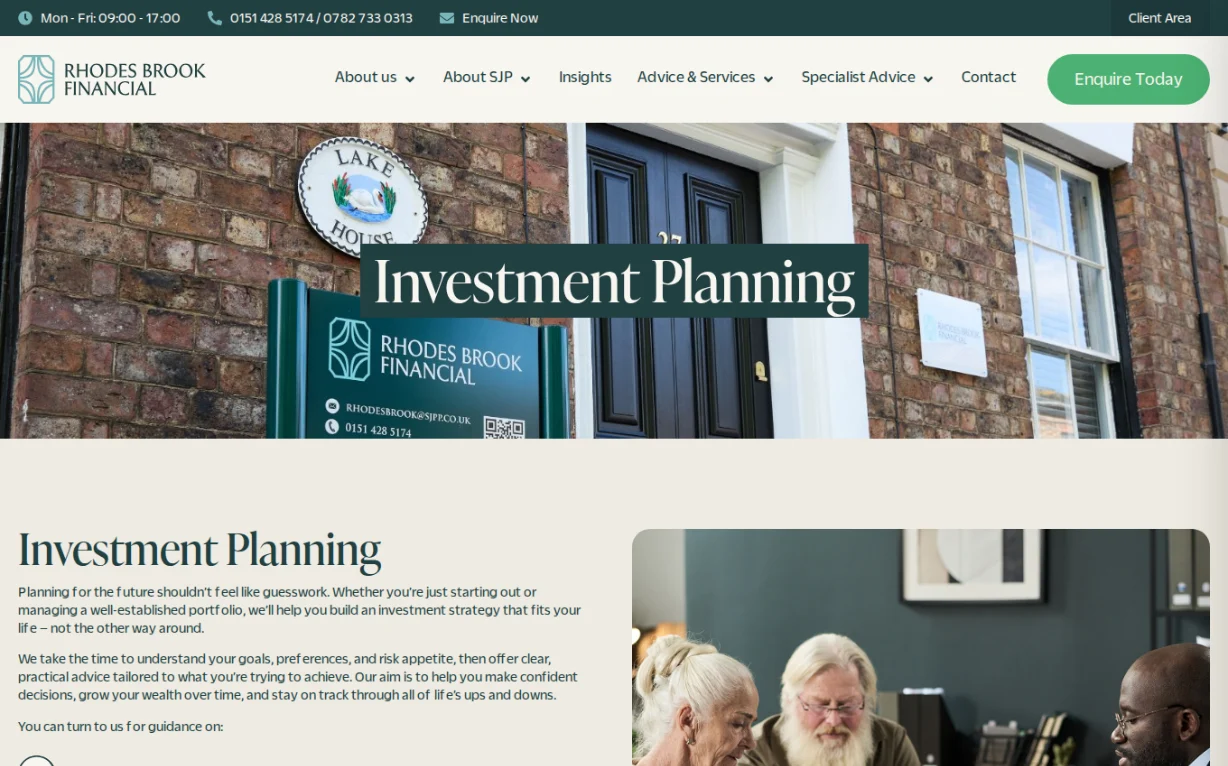
- New visual identity- modern logo, calm typography, a fresh green palette chosen to evoke warmth, stability, and trust. Tested across web and print for consistency.
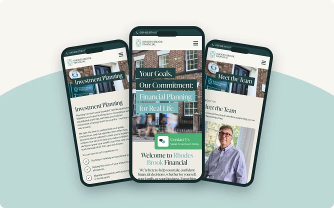
- Complete website rewrite- every page written from scratch in plain English. Financial planning is complex. Sood stripped out the jargon and explained key concepts in language anyone could understand, refined in close collaboration with the team for accuracy and compliance.
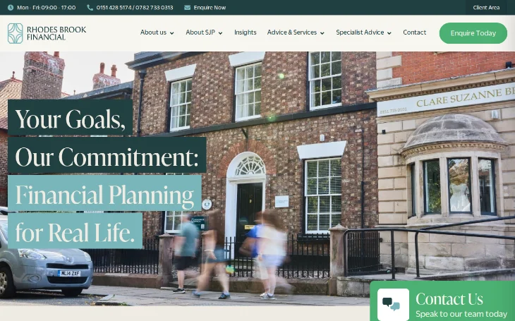
- Website redesign and build- clear navigation, purposeful hierarchy, space and colour used to create a sense of calm and confidence that mirrors how Rhodes Brook makes their clients feel.
- Full brand guidelines- detailed documentation so the identity stays consistent across every touchpoint as the business grows.
5
Brand pillars
Empathy, Personalisation, Trust, Expertise and Education.
100%
Pages rewritten
Every page written from scratch in plain English.
4
Workstreams
Identity, copy, website and brand guidelines, delivered together.
0
Jargon
Key concepts explained in language anyone could understand.
The results
Rhodes Brook now has a visual identity and online presence that match the quality of the advice behind it. Professional, personal, and built to grow with them.